
Guides · updated 24 July 2026
Five numbers, and your file prints the first time
The short answer: a PDF with fonts embedded, 3 mm of bleed, a 3 mm safety margin inside the cut, images at 300 dpi at final size and colours in CMYK. That is the whole specification. Everything else on this page is about the cases where a label needs something a flyer does not — a cut line, a white layer, a foil layer.
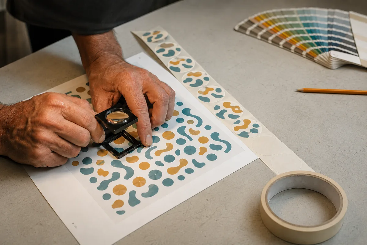
The specification
What we need, and what we do if it is missing
| Item | What we need | What we do if it is missing |
|---|---|---|
| Format | PDF, fonts embedded | We accept AI, EPS, PNG and JPEG too |
| Resolution | 300 dpi at final size | We flag anything that will look soft |
| Bleed | 3 mm beyond the cut | We extend the background where we can |
| Safety margin | 3 mm inside the cut for text | We move text in and show you on the proof |
| Colours | CMYK | We convert RGB and warn where a colour will shift |
Send what you have. We check every file before the proof and tell you what we would change rather than printing a disappointment — that check is included, not an option.
The three lines
Bleed, cut, safety — and why all three exist
A label is cut by a die pressing through a moving web. It lands within a fraction of a millimetre, not on it, and those fractions are what the three lines absorb.
The cut line is your final size — the shape you will hold. Bleed is 3 mm of background extended beyond it, so that a cut landing slightly outside still finds ink rather than white paper. The safety margin is 3 mm inside, and it is where nothing important may sit: a cut landing slightly inside must not take the top off your text.
The consequence people miss: a border or a frame drawn at the edge of a label is the hardest thing to print well. If it sits 1 mm from the cut, a normal tolerance makes it 0.5 mm on one side and 1.5 mm on the other, and the eye reads that as a crooked label. Either bring the frame well inside the safety margin, or let the colour bleed off the edge entirely.
- Bleed
- + 3 mm outside the cut
- Cut line
- your final size
- Safety
- − 3 mm inside the cut
- Never near the edge
- frames, thin borders
- Never at the edge
- text, barcodes, legal mentions
Colour
Four places colour moves, and three of them are avoidable
RGB to CMYK
Bright greens, deep blues and orange-reds are the ones that lose intensity. Convert before you approve the design, not after — we warn you, but the file is yours.
Black text in four colours
Small text built from all four inks looks fuzzy and shows any register drift. Set text in 100 % black only. Keep rich black for large solid areas.
The material itself
The same file prints differently on kraft — everything turns browner — and on an uncoated creative paper, where colours soften. That is the stock, not the press.
Screen against paper
A backlit screen always looks brighter. Judge colour on the printed proof, not on the monitor — and if a colour is critical, tell us which one before the run.
💡 If a brand colour has to be exact, say so with your file: on the ranges that offer one or two colours, a named ink is both more accurate and cheaper than four-colour printing.
The label-specific part
Three layers a label needs and a flyer never does
The cut line. If your label is not a plain rectangle, draw the outline as a vector path on its own layer, in a spot colour named « cut », and set it to overprint so it does not knock a hole in your design. One closed path, no double lines.
The white layer. On a clear film, white is not the absence of ink — it is an ink. Anything that must appear opaque needs a white shape underneath, on its own layer, in a spot named « white ». Without it, your white text is simply the bottle showing through.
The foil or varnish layer. Hot foil and selective varnish are separate passes: supply them as solid black shapes on their own layer, named, at the exact position they occupy. A foil area drawn in gold ink tells us nothing about where the foil goes.
- cut
- vector path, spot, overprint
- white
- on clear films only
- foil
- solid shapes, one layer
- varnish
- solid shapes, one layer
- Rule
- one layer, one purpose, named
Codes
A barcode that does not scan is a reprint, not a detail
Leave the quiet zone
The empty margin either side of a barcode is part of the code. Text or a frame pushed against it stops the scanner finding the start.
Dark on pale, never reversed
Black on white scans; white on black often does not, and a code printed in gold on a metallic stock almost never does.
Do not stretch it
Scaling a barcode non-proportionally changes the bar widths. Resize it evenly, keep it above 80 % of nominal size, and never rebuild it as an image.
A QR code needs at least 10 × 10 mm with 3 to 4 mm of clear space around it — see the wine e-label, which is read in cellar light. If the codes have to change from one label to the next, that is variable data: you send a starting number or a list, and we generate them.
After you send it
Nothing prints before you have said yes
We open the file, check it against the five lines above, and produce a proof: your artwork at final size, with the cut line shown, on the material and finish you ordered. If something would print badly — text in the safety margin, an image at 120 dpi, white areas on a clear film with no white layer — we tell you before the proof rather than after the run.
Production starts when you approve it, and the 4 to 10 working days count from that approval, not from your order. Which is worth knowing when a date is tight: the fastest way to lose a week is to send a file, disappear, and approve the proof six days later.
No file yet? Tell us what you need — layout and design work is quoted separately, and a simple label is a small job.
- 1
- You send the artwork
- 2
- We check it — included
- 3
- Proof at final size
- 4
- Your approval
- 5
- 4 to 10 working days
FAQ
Artwork — what customers ask us
What file format should I send?
A PDF with the fonts embedded is ideal. We also accept AI, EPS, PNG and JPEG — send what you have rather than delaying the job. What matters more than the format is that images are 300 dpi at final size and that text is still text, not a picture of text.
How much bleed do you need?
3 mm beyond the cut line, and a 3 mm safety margin inside it where no text or barcode sits. If your file has no bleed we extend the background where the design allows it, and tell you where it does not — a photograph can usually be stretched, a precise pattern cannot.
My label is not rectangular. How do I send the shape?
As a vector path on its own layer, in a spot colour named « cut », set to overprint — one closed path, no duplicates. If you only have the shape as a sketch or a photograph, send it anyway and we redraw it; on labels the die is included, whatever the outline.
Why does my white text disappear on a clear label?
Because white is an ink, not an absence of ink. On a transparent film anything meant to be opaque needs a white shape printed underneath, supplied on its own layer named « white ». Without that layer, your white text is simply the bottle showing through — this is the most common surprise on clear labels.
Will you fix my file if it is wrong?
We check every file and correct what can be corrected without changing your design — extending a background, nudging text out of the safety margin, converting RGB. Anything that changes the design itself we show you on the proof and let you decide. Nothing is printed before you approve it.
Still unsure?
Ask the person who makes them
The guide covers the general case — your label lives on a real product. Describe it in two lines and a label specialist (not a bot) answers within 2 working hours.
All guides
Everything else we have written down
- Choosing your label material
- Choosing your label adhesive
- Bottle and jar label sizes
- EU food labelling — the INCO rules
- EU wine label rules
- Environmental claims and sorting labels
- Preparing print-ready files — you are here
- Variable data, explained
- Label material comparison chart
- EU vs UK labelling requirements
- What drives the price of a label
- Label glossary
- Direct thermal vs thermal transfer
- GS1 Digital Link and QR codes
- Barcode print quality and ISO 15416 grades
- GHS and CLP chemical labels, BS5609 included
- Printed packing tape vs labels, cost per parcel
Your file is ready. Price the run.
We check the artwork before the proof — included, on every order.